Friday, 18 March 2011
The Shoot

Friday, 4 March 2011
Comparing Movie Posters

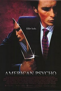
1. Yes it is.
2. Yes, the main character.
3. It shows the film as very dark using colours like burgundy and black that does in fact reflect the dark tone of the film.
4. It uses a sort of close up image of Patrick Bateman with a knife and the blade reflecting Patrick
face.
5. The slogan is a reference to the character and his personality.
6. There is the usual list of people who made the film.
7. I think it is persuasive because it could really appeal to fans of horror and dark humour (the latter if they know anything about the film or book that it’s based off).

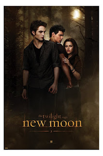
1. 1. Yes
2. 2. Yes they are, the main character and the vampire and the werewolf that are fighting over her through out the film.
3. 3. It’s made to look very dark and about romance where it is half right because the film in fact isn't that dark.
4. 4.The image shows the main three characters with a forest background behind them.
5. 5. There isn’t one.
6. 6. Only the New Line Cinema logo and the title.
7. 7. 7. Because the name The Twilight Saga is on it.